|
|
||||||||||||||||||||||||||||||||||
|
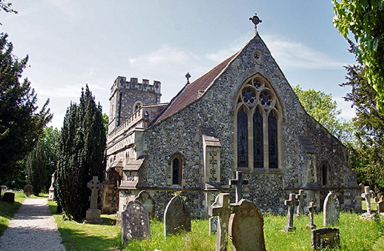
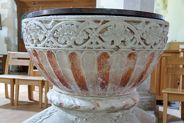
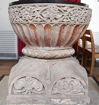
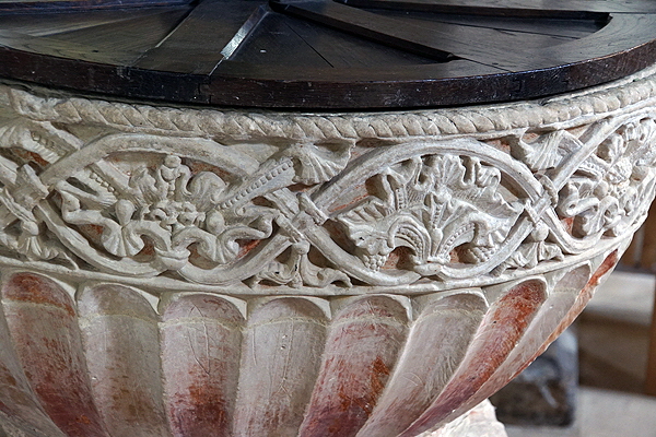
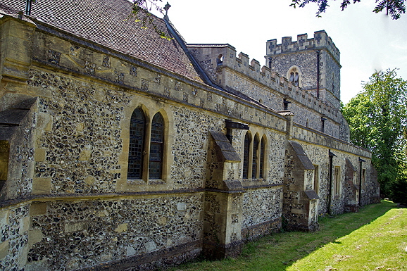
craftsman than more celebrated writers evidently do. If you want to see the very depths of pretentiousness, read a few academic papers about mediaeval stonemasons.Some of the authors are so far up themselves they must suffer from Vitamin D deficiency. Anyway, the Aylesbury fonts are distinguished - and that is the right word - by their goblet shaped bowls with fluting decoration. They are placed on scalloped bases, Apart from the unusual imagination of this design - beyond the dreams of the masons’ pre-Conquest predecessors - one cannot help but be impressed by the regularity of the flutes themselves; thirty or forty of them miraculously going through 360 degrees without the last ones showing the limitations of Norman geometry. The rims above the fluting are carved stylised designs and at Great Kimble these are very fine indeed. The font was carved from a block of stone weighing two tons from Totternhoe in Bedfordshire. The stone for all of the Aylesbury fonts came from there. But in saying “came from there” what do we actually mean? It is better than fifty-fifty (unless someone knows better) that they were also carved there and transported as finished goods. In that regard it is surely significant that the Aylesbury fonts are all mostly close to the ancient Icknield Way or to what is now the B485. The notion that they were carved at the quarry by a group of sculptors has considerable logic to it. As for the current building itself here, the arcades seem to be late thirteenth century and the chancel arch fourteenth century. The two aisles were originally of that era but were rebuilt by the Victorians. The Victorians, indeed, were responsible for most of the exterior we see now. So not a very interesting building. Yet somehow it works and is no less interesting and certainly not less endearing than many an all-Mediaeval building. There is a nice “feel” to it. And if you are an experienced church crawler you will know exactly what I mean. |
 |
 |
||||||||||||||||||
|
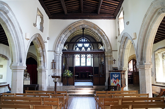
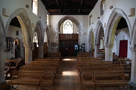
Left: Looking to the east. The chancel arch is early fourteenth century. Right: Looking west. The tower arch is too fourteenth century. |
|||||||||||||||||||
 |
 |
||||||||||||||||||
 |
 |
||||||||||||||||||
|
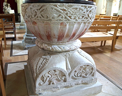
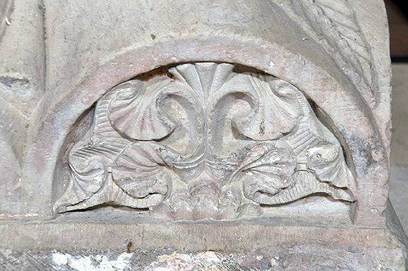
Four views of the font. Pevsner was moved to call it “uncommonly beautiful”. The base is like an inverted capital and has double decorative lunettes on each side. Note the pretty leaf carvings at each corner. |
|||||||||||||||||||
 |
 |
 |
|||||||||||||||||
|
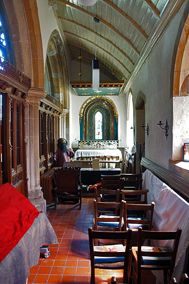
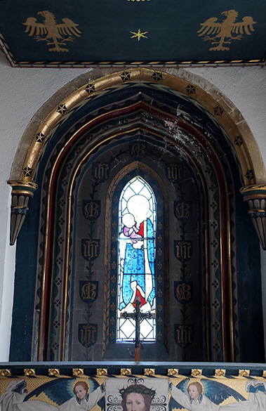
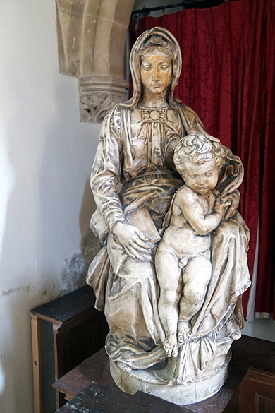
Left: The south chapel is a Victorian and a rather anorexic affair. The east end looks pretty RC but there is an air of quiet sanctity that I liked. Centre: East window of the north chapel in Early English lancet style. Is this original - it fits with the original building date - or is it a Victorian replacement? The painting will not be to everybody’s taste but it is a splash of colour. Right: A copy of the “Bruges Madonna” by Michaelangelo. and dedicated to one of the Gilbert Scott dynasty of architects. Giles, I believe. Blimey. The Reformers and the Puritans would have been round here like a shot with picks and hammers, wouldn’t they? It sits upon the Jacobean table which replaced the altar. This was a post-Reformation trope: reformers loathed east end altars and demanded that a table was used in the body of the church. It would be particularly true here because in the early seventeenth century the manor was held by Richard Hampden, son of the the “Great Patriot” John Hampden. John was the one who refused to pay Charles I’s “Ship Money” and was one of the five men the King tried (illegally) to arrest in parliament only to find in Charles’s immortal words “I see the birds have flown” The others were John Pym, Denzil Holles, William Strode and Arthur Haselrig. The Hampdens, of course, were conspicuous Puritans. I would love to think that the parish saw the delicious irony of a Madonna being placed upon a post-Reformation altar table. But I am not optimistic. |
 |
 |
|
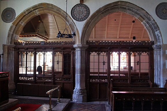
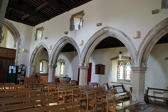
Left: The south arcade with screens through to the south aisle. An unusual arrangement. Right: the south aisle, looking west. The arcade is of the same late late thirteenth/early fourteenth century date as its southern counterpart. |
 |
 |
|
Left: One of the font’s base lunettes shows the quality of the carving on the splendid font. Right: The north side. |
|
|
|
|
I hope you have enjoyed this Page and, perhaps, many more besides. Could you help me to make it better still and preserve its future? |
|
This is a downloadable and printable version of this page. |
|||
