|
|
||||||||||||||||||||||||||||||||||||||||||||||||||||||||||
|
Please sign my Guestbook and leave feedback |
||||||||||||||||||||||||||||||||||||||||||||||||||||||||||
|
Recent Additions |
||||||||||||||||||||||||||||||||||||||||||||||||||||||||||
|
|
||||||||||||||||||||||||||||
|
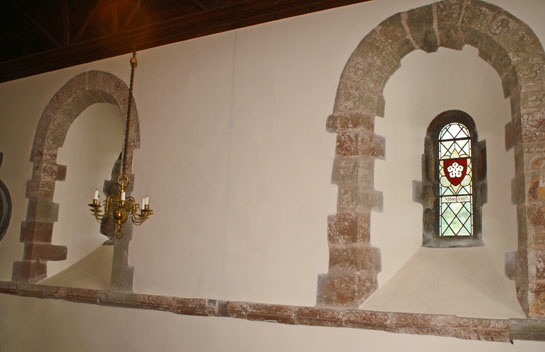
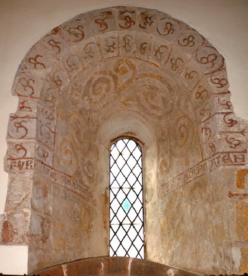
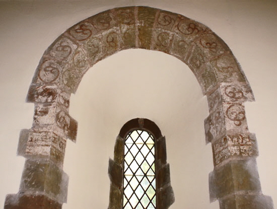
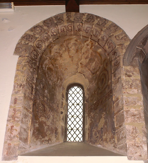
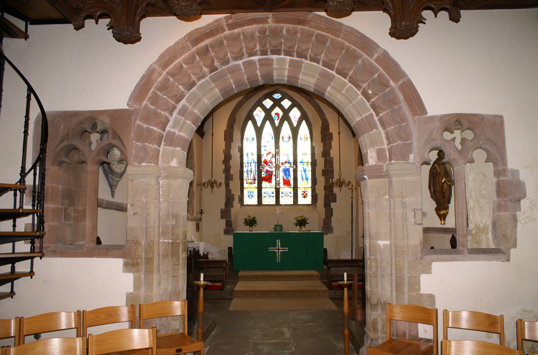
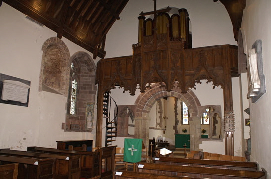
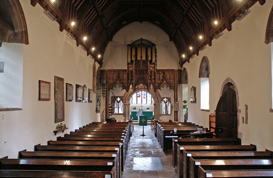
The most striking structural feature remaining is the gorgeous little chancel arch. It is simple and decorated only by some simple chevron moulding but its proportions and masonry are exquisite. It is perhaps, undersized for a church that has over time been extended so we must be grateful for its survival. This doubtless is because squints were inserted on each side of the arch in somewhat unorthodox but nevertheless pleasing fashion. That on the south side is original fifteenth century. The one on the north is a copy that replaced a narrower and asymmetric mediaeval original. Curdworth is a somewhat unconventional church and that is immediately apparent from the placement of a wooden organ loft over this arch in 1895. It is certainly striking and I am struggling to think of another parish church that I have visited that has the same arrangement. It must have seemed a good idea at the time but it is a pity to have diminished the chancel arch in this way. There are a few surviving deeply-splayed Norman windows. Two are on the north side of the chancel and one on the south. There is another just west of the chancel arch on the north side. Their interest is considerably enhanced by the survival of thirteenth century wall painting within the splays. Other than these, the windows are straightforward Gothic of various vintages. On th north side there are two filled-in doorways quite close together. The easternmost was clearly the original Norman one. To the west of it is what was clearly a pointed arch that presumably dates from the westward extension of the nave in 1460. Interestingly it is lower as well as wider than the Norman doorway. On the south side is another blocked Norman doorway. The font, however, is the principal glory of this church. As is so often the way with fonts, this one was “rediscovered” during restoration work in 1895, on this occasion from beneath the church, Victorian restoration strikes fear into the heart of the student of mediaeval churches, but it can have its benefits! Pevsner describes the font as “barbarous”. He was fond of this term, especially when describing Norman fonts. Many that he describes thus are, in my view, primitive or naive. Curdworth’s font, however, deserves that epithet. Perhaps the only other I can think of that is like it is at Luppitt in Devon. Like Luppitt’s font, Curdworth’s seems to have been carved with savage intensity. The lines are bold and deeply-incised. Every square inch is carved. That tragedy is that at some point in time someone has removed the top few inches. That was not so much “barbarous” as barbaric. Had it been intact I believe Curdworth’s font would have claim to being one of the best in the country. Even damaged as it is, it is a fascinating and important piece of Romanesque art. |
 |
|
The Norman chancel arch. Note the two restrained courses of chevron decoration on the central course. It is a retrained piece of work, simple in the designs of both the arch and the capitals. This could be because the age of real Norman extravagance was coming to a close or because the mason valued simplicity. For me, it’s a thing of beauty, The squints were a practical and attractive answer to the problem of an under-sized chancel arch. That of the south is original but that of the north is a copy. The simple east window with scissors tracery is a typical Decorated style design of the fourteenth century. |
 |
|||
 |
|||
|
Left: Looking towards the east with the nineteenth century organ loft dominating the scene. It is rather a shame that the “decorative” cusping intrudes into the sight line of the chancel arch. I guess nobody was valuing Norman architecture much in those days. It is not so much the idea of putting the organ here that is the problem: it is the unsympathetic execution. Right: A slightly different angle shows one of the original Norman windows sitting just to the west of a fourteenth century Gothic one. Note the painting in the splay. Note also the addition of a rood cross to the organ loft, doubtless inspired by the Roman Catholic revival of the time. |
|
|
||||||||||||||||||||||||||||||||||||||||||
|
Left: The Norman window on the south side of the chancel has painting within its splay as well as on its voussoirs. The inscription is unusual and intriguing but I have no idea what it means! If you look very closely you can see faint traces of figures on the lower left of the splay and these could be Mary and the Archangel Gabriel. Right: The north nave Norman window, The patterning is very similar to the north chancel window and, again a band of script is very clearly visible. |
 |
 |
||
|
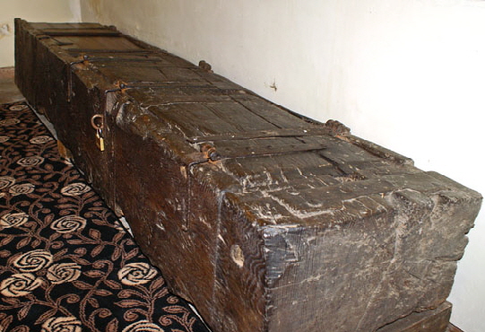
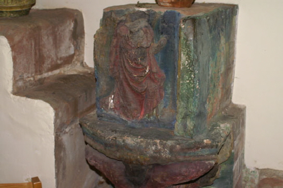
Left: A mediaeval “dug out” chest. It is nearly ten feet long (!) and has two separate lids of which was was renewed. Right: This is a curious thing - and I’m not certain what it is. It’s obviously headless (although human, not a chicken!). Possibly a redundant corbel stone? |
 |
 |
|||||||||||||||
 |
||||||||||||||||
|
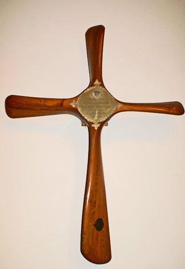
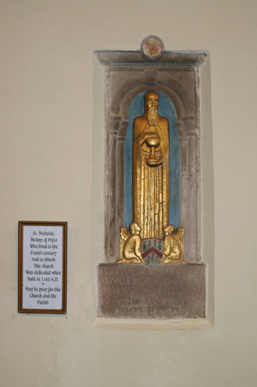
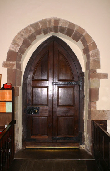
Left: The south door is not in its original place. Yet curiously the Norman rear-arch has been reused. Centre: Nearby Castle Bromwich - a childhood haunt of mine - played an important part in both world wars. During the 1939-45 conflict a factory there produced 12,000 Spitfire fighter and 3,000 Lancaster bombers. One of my earliest childhood memories was being taken to “Castle Bromwich Aerodrome” for a flying display. I have calculated that it was likely to have been in around 1956. By that time I imagine the aircraft were early jet fighters such as the Gloster Meteor and Hawker Hunter. I only remember crying at the volume of sound! In the First World War it was not the Royal Air Force but the Royal Flying Corps and in those days the aerodrome was used to form and train squadrons prior to their shipping out to France. At that time the aerodrome fall into the parish of Curdworth (although I am pretty sure Castle Bromwich parish church was actually closer), Although, of course, RFC operational casualties were incurred almost exclusively in France and Belgium, those early aircraft were at best unreliable and in some cases almost as dangerous to the pilots and observers as they were to the enemy! Unsurprisingly, there were many mishaps. This memorial made in the form of a propeller-like cross (don’t fly in any aircraft with a prop like this) and is to the memory of Lieutenant Woodrow, a member of the Royal Australian Flying Corps, killed in a flying accident on 23 September 1916. Right: There are quite a few oddities scattered around the church. This is a representation of St Nicholas of Myrna to whom the church was dedicated and is a memorial to one Lancelot Mitchell, priest here between 1905 and 1937. |
||||||||||||||||
 |
||||||||||||||||
|
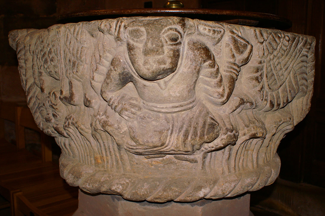
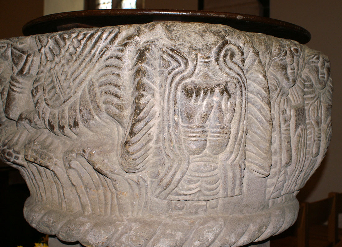
This is perhaps the most “in your face” part of the splendid font. A human demi-figure holds up an object that is now missing while his other hand rests seemingly on his hip. He has been described as “Atlas-like”. Note the cable moulding around the base which firmly suggests a Norman rather than an Anglo-Saxon origin. |
||||||||||||||||
 |
||||||||||||||||
|
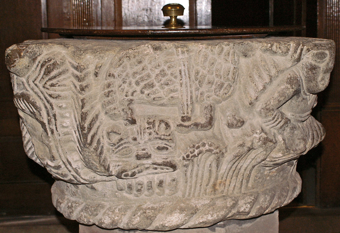
With the Atlas figure now on the right, the main theme on this face is clearly a Lamb of God. he has lost his head and his flag but it is unmistakable. The criss-cross pattern of his fleece is rather odd but stylistically it is in keeping with the rest of the font. A long-necked beast with a cat-like face snakes around him. Is the lamb of God trampling over the Devil? |
||||||||||||||||
 |
||||||||||||||||
|
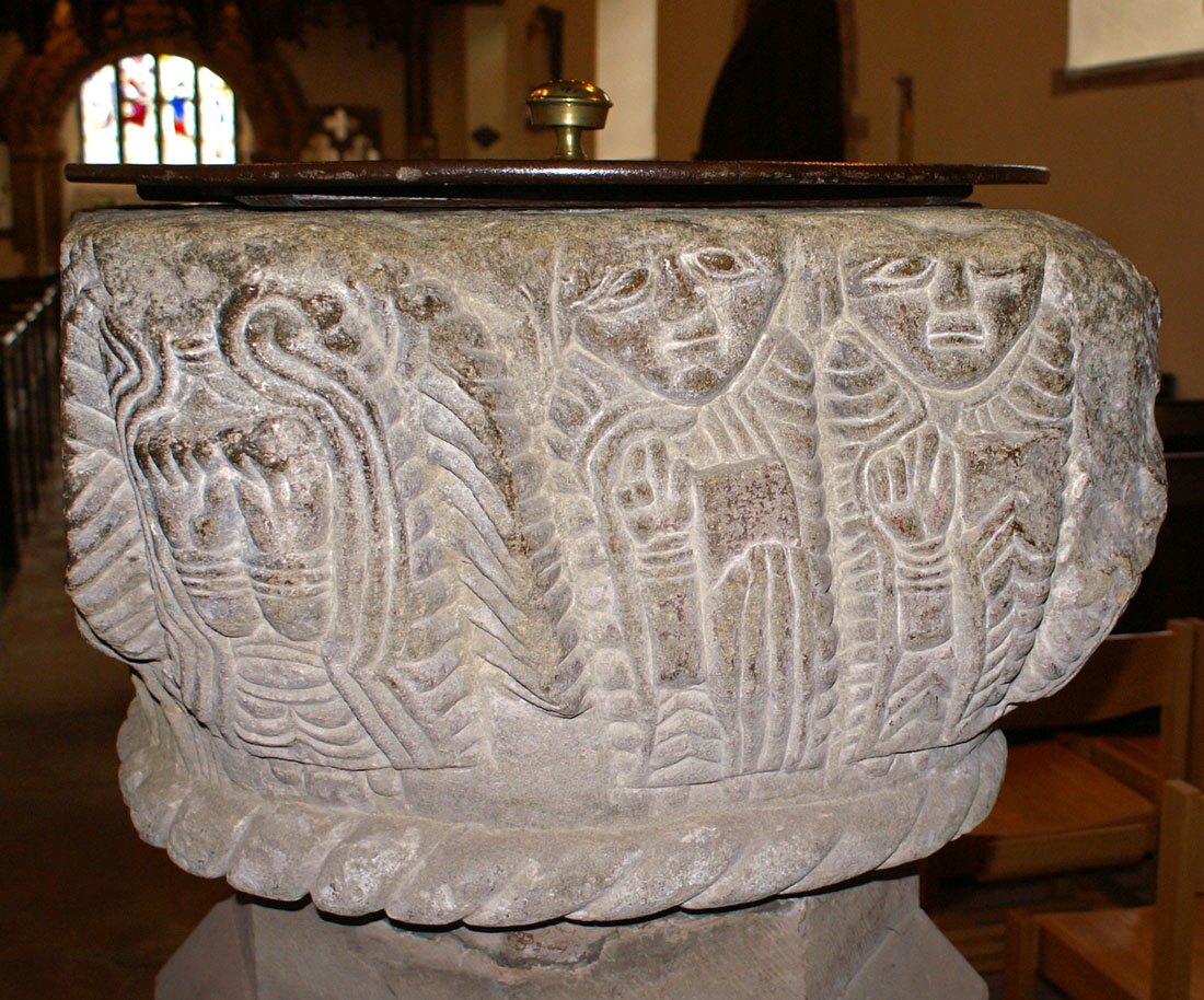
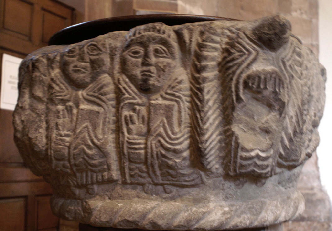
These two men are holding books and have their other hands raised, One presumes they are evangelists. To their left is what appears to be a headless angel, He has wings either side of him and both hands raised. Possibly they are meant to be together to denote prayer. The style theme of deep, long and bold incisions is very clear here. |
||||||||||||||||
 |
||||||||||||||||
|
The wings of the headless angel are quite clear here. To the left is a winged creature but his head has gone and we can only guess at what it was - good or evil? |
||||||||||||||||
 |
||||||||||||||||
|
Finally, this is the south west corner of the font and the figure here is defaced - probably from rough treatment when it was buried, before its re-discovery in 1895. |
||||||||||||||||
 |
||||||||||||||||
 |
||||||||||||||||
|
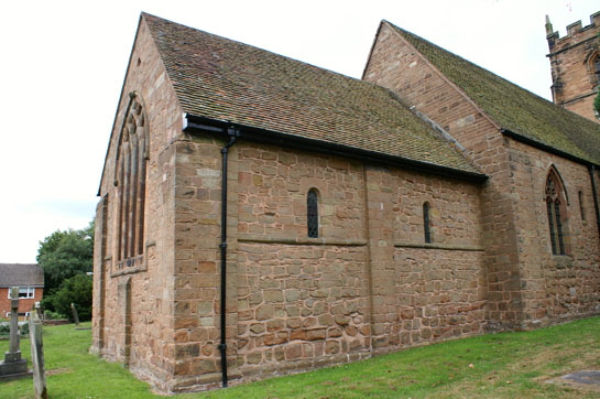
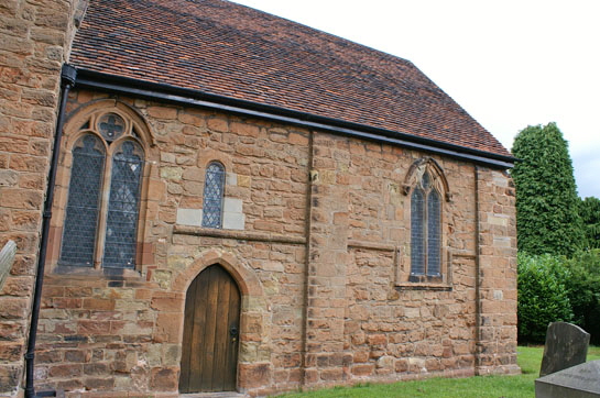
Left: The south side of the chancel with a Norman window visible just above the priest’s door. Right: The north side of the chancel. There are no Gothic windows on this side and two Norman windows survive, The string course - also seen on the south side - is also Norman but it has been interrupted by (slimline!) later buttressing. |
||||||||||||||||
 |
||||||||||||||||
 |
||||||||||||||||
|
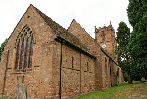
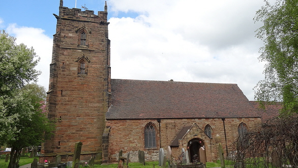
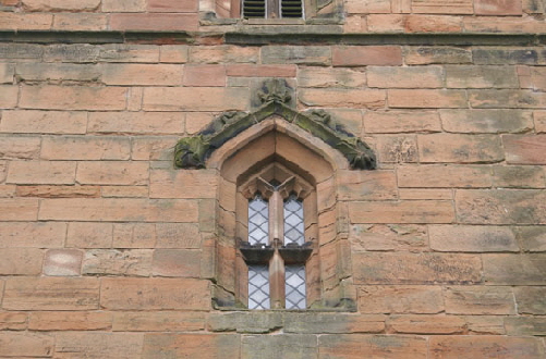
Left: The south side of the church, Right: The tower dates from the 1460 extension. Right: This area of the West Midlands specialised in unusually ornate mouldings over doors and windows - see also Coleshill. Here is an example from Curdworth’s tower. |
||||||||||||||||
