|
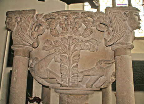
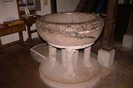
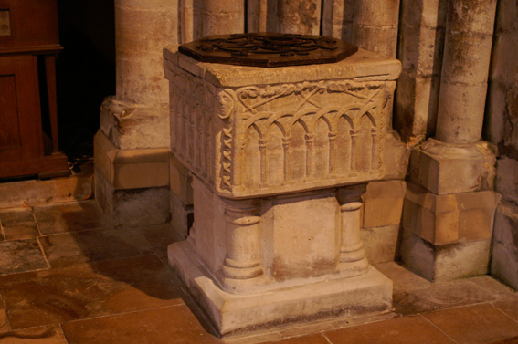
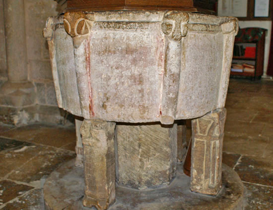
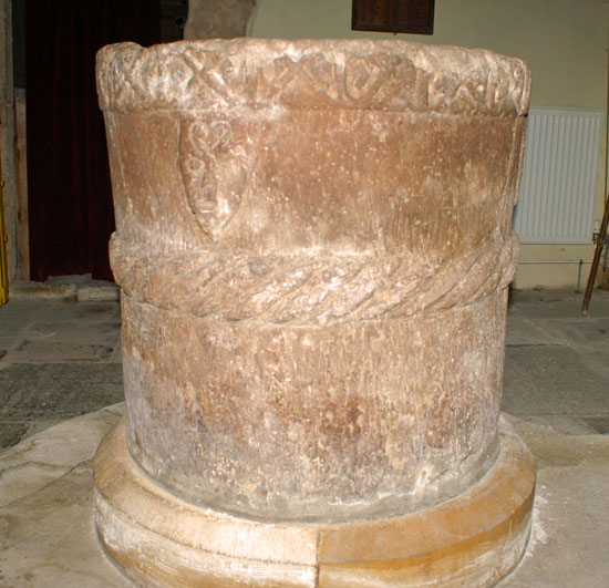
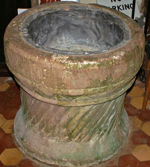
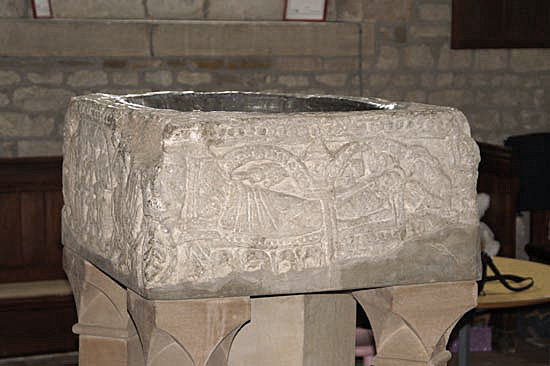
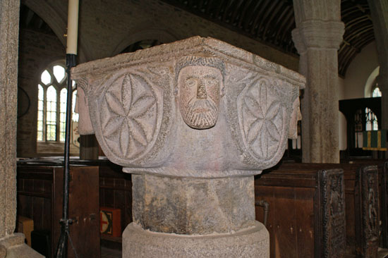
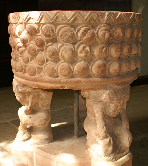
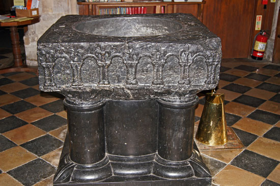
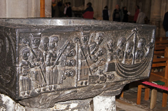
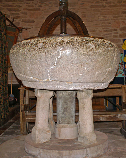
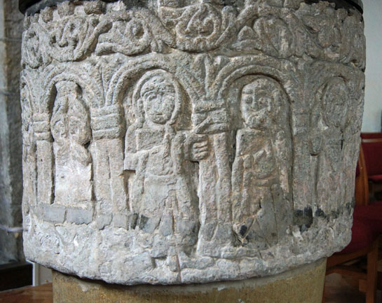
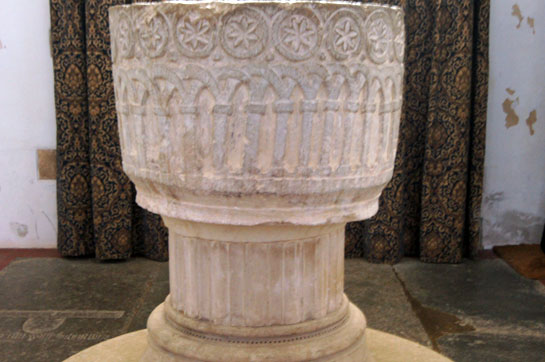
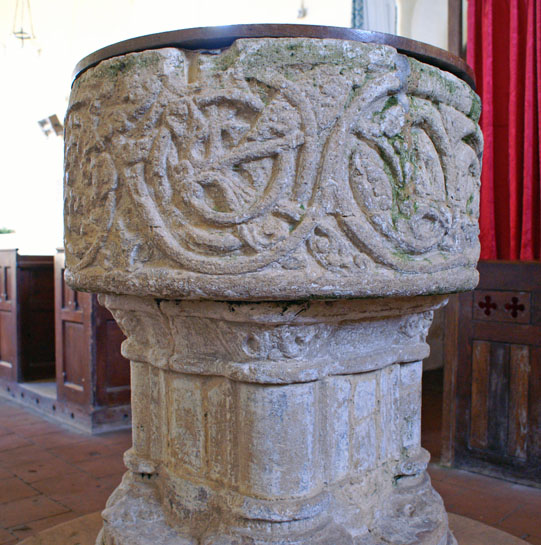
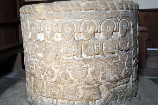
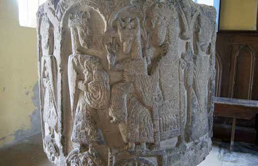
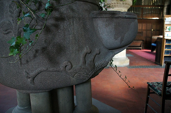
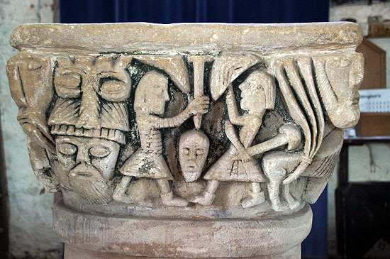
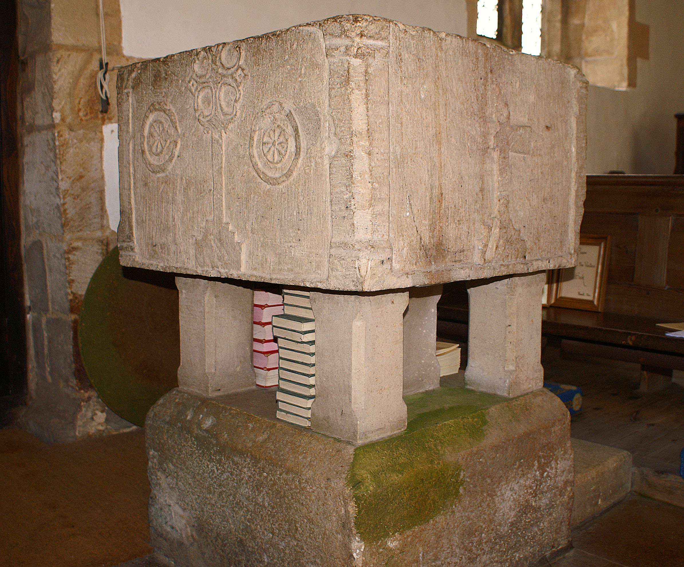
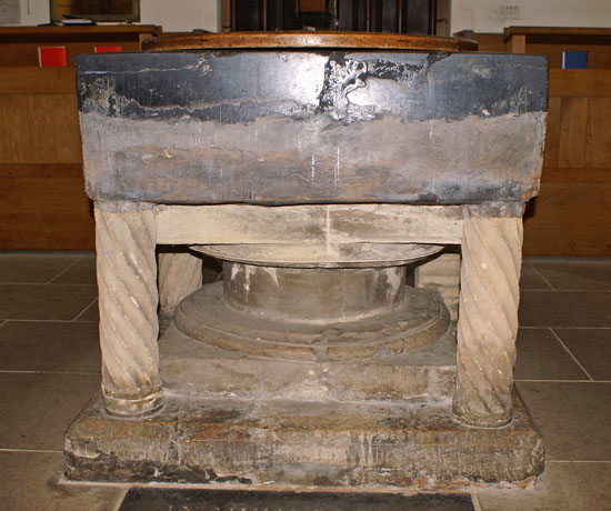
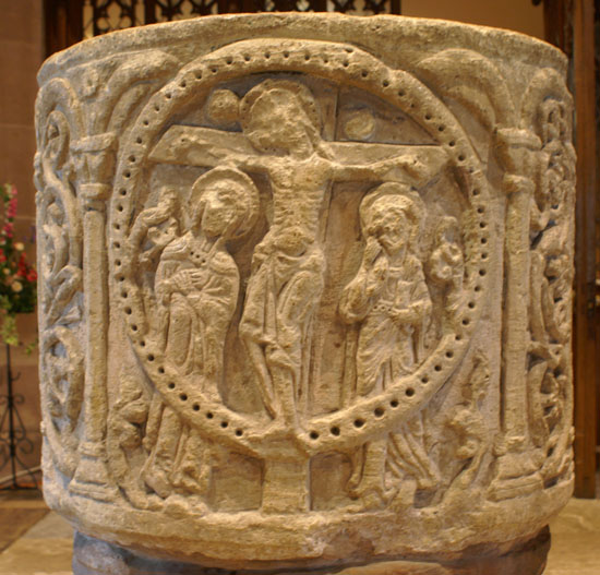
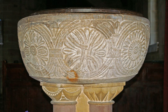
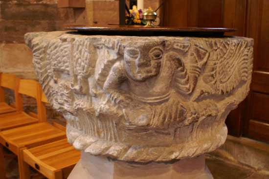
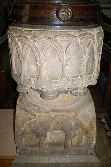
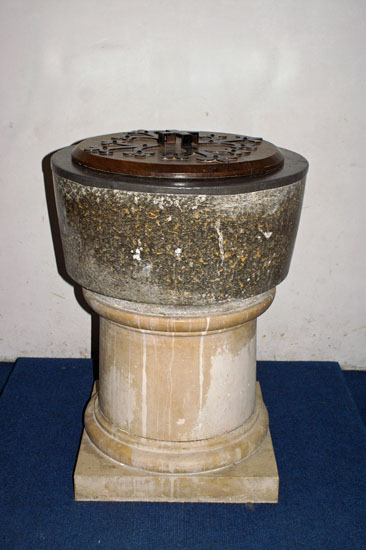
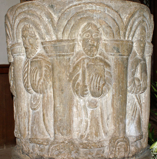
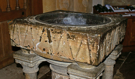
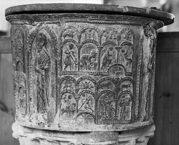
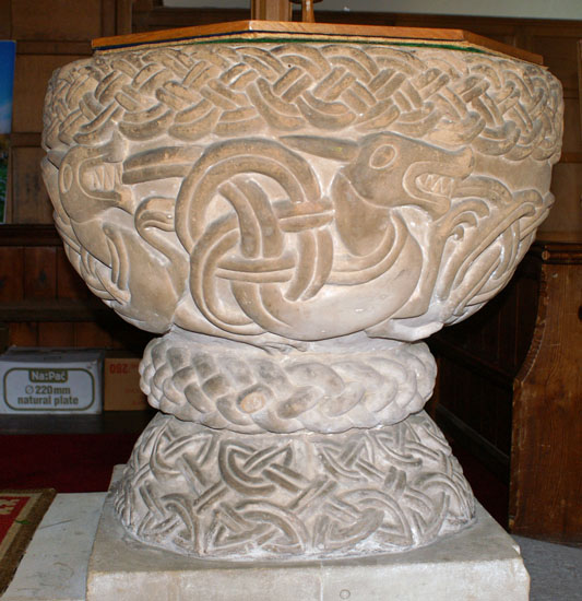
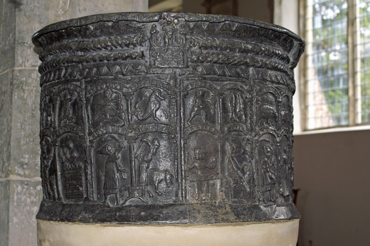
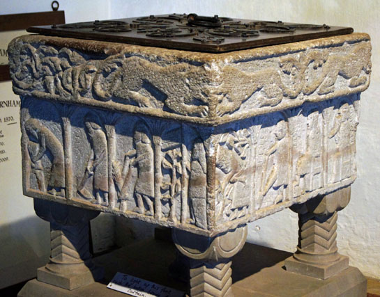
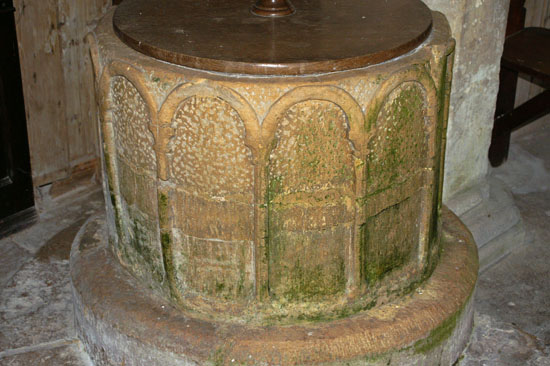
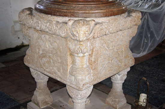
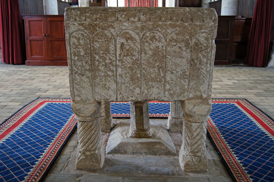
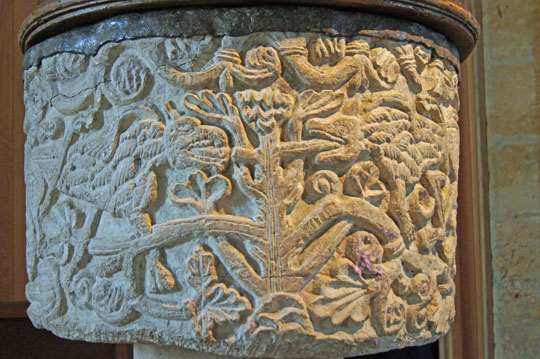
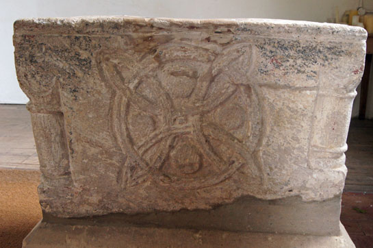
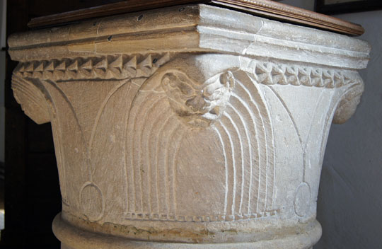
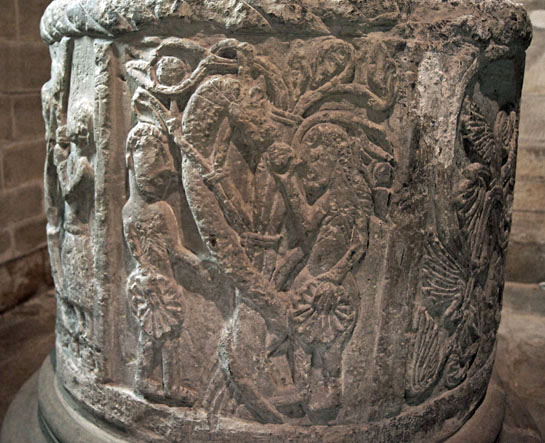
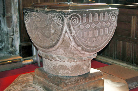
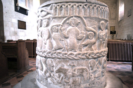
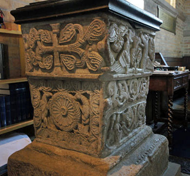
This is one of the pages which I am going to dedicate to aspects of architecture that are amongst my favourites. I feel that seeing pictures side-by-side in this way will create more immediate awareness of the diversity that there is in English churches. Diana and I will travel some way to see a Norman font. There are many on this website, with many more to come, but rarely if ever can a visitor dismiss one as “just another Norman font”. I have to sound a note of caution about the word “Norman”, however. Some originate quite late in the Norman period and the exact dates are invariably speculative. This means that some may well have been made in the Transitional period (around 1175-1200) where Romanesque and early Gothic styles were overlapping. Oakham is a good example. If a font appears on this page, therefore, it is because the font is clearly Norman in style and is definitely not Saxon or Gothic.
The variety is enormous. Some are decorated with beasts, others with religious figures. They are round, they are square. Most are made of stone, one or two are made of lead. Some are extraordinarily sophisticated, others crude in the extreme. All the beliefs and fears if men and women in the Norman age are here. They really are amongst our most important architectural treasures, but they are in a church near you, and free to see!
Many pictures have hypertext links to a church covered by this site. Others do not, but they are all pending as I try to find time to write the pages. Please be patient!.
|
