|
Alphabetical List |
|
|
|
|
|
|
|
County List and Topics |
|
|
|
Please sign my Guestbook and leave feedback |
|
|
||||||||||||||||||||||||||||
|
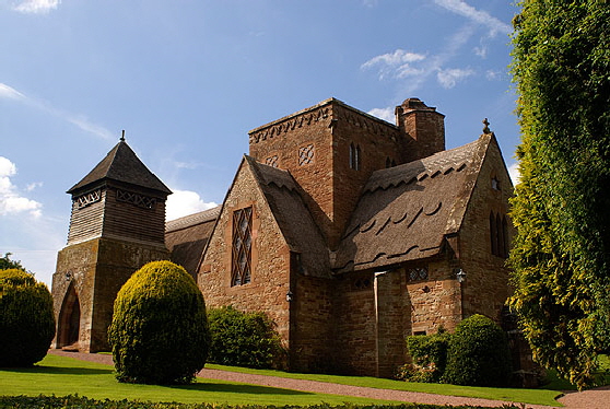
help to explain why the church Lethaby built was still recognisably on mediaeval lines. Nevertheless, there is nothin “neo-” about this design. Most of the windows are rectangular and the few lancet windows are not at all in Early English style proportions and nor are they pointed. Perhaps the most daring departure is in the location of the timber-built belfry atop the stone south porch rather than as an upward extension of the central tower. Arts & Crafts practicioners were great collaborators. Thus, the windows are by Christopher Whall, the altar tapestries by Burne-Jones and made in the workshops of William Morris & Co. Sadly, Lethaby himself never built another church. A young architect to whom he delegated much of the work built the tower higher than Lethaby had specified and failed to report the collapse of an arch. Lethaby waived his fee and turned his talents towards teaching. If you are in the area to enjoy the Norman church legacy and to revel in the gorgeous carvings of the Herefordshire School do take a detour to Brockhampton. It is a beautiful creation that pays homage to traditional architecture whilst fearlessly employing new ideas and materials. It is so much more creative than the “Victorian” habit of using Gothic (and occasionally Norman) design and then changing it just enough to make it a pastiche. The Normans would have been proud of Brockhampton, I feel. It is the place that “turned me on” to Arts & Crafts. Diana got there decades before me! |
 |
 |
|||||||||||||||||||||||||||
|
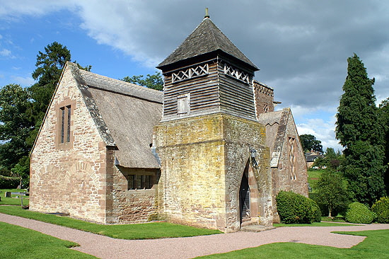
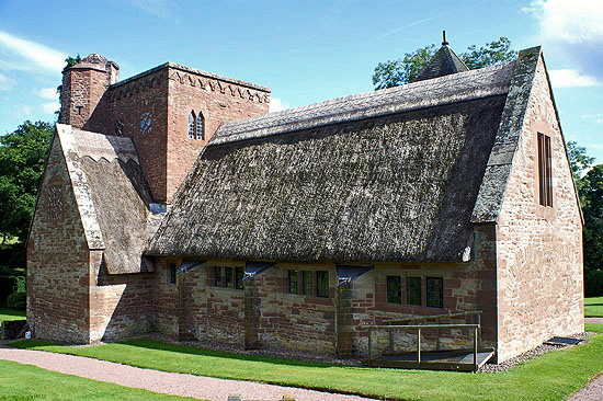
The church from (left) south west and (right) south east. Notice that the west end has the outline of two round headed arches that are the reverse of two blind arches within. Note also the little wooden door on the west side of the belfry. Note also that the north transept, unlike its southern counterpart, has no windows. You can see, however, that the nave is illuminated by ten small rectangular windows. |
||||||||||||||||||||||||||||
 |
 |
|||||||||||||||||||||||||||
|
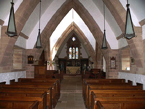
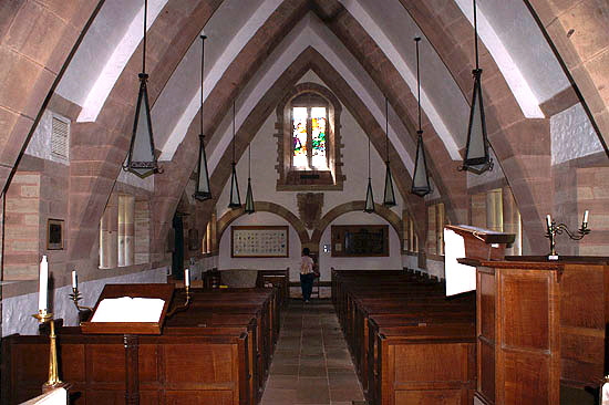
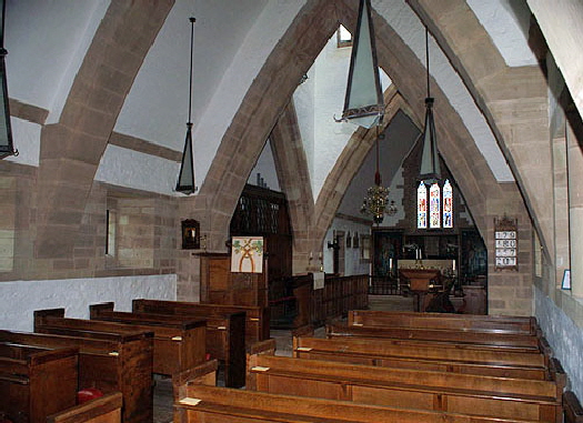
Left: The nave looking towards the west end. The cross section is like no mediaeval church: like its much larger counterpart at Roker in Tyne and Wear its profile might be best described as being like the inverted hull of a ship. This is unlikely to be a coincidence as the word “nave” is derived from the Latin word “navus” or ship. Furthermore, the font is in the shape of a bollard. Note that the profile is strongly tapered and the modest three light east window has been carefully designed not to be obstructed to the viewer anywhere in the nave. Right: Looking towards the west end. Note the two broad round headed blind arches that create a delightful geometric composition with the inverted hull profile and the west window. It would be easy to overlook the pendant lights that are triangular in profile and fit beautifully with the near-triangular nave profile. Note also the pink sandstone highlighted by the whitewashed walls. |
||||||||||||||||||||||||||||
 |
||||||||||||||||||||||||||||
 |
||||||||||||||||||||||||||||
|
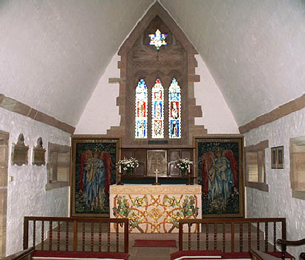
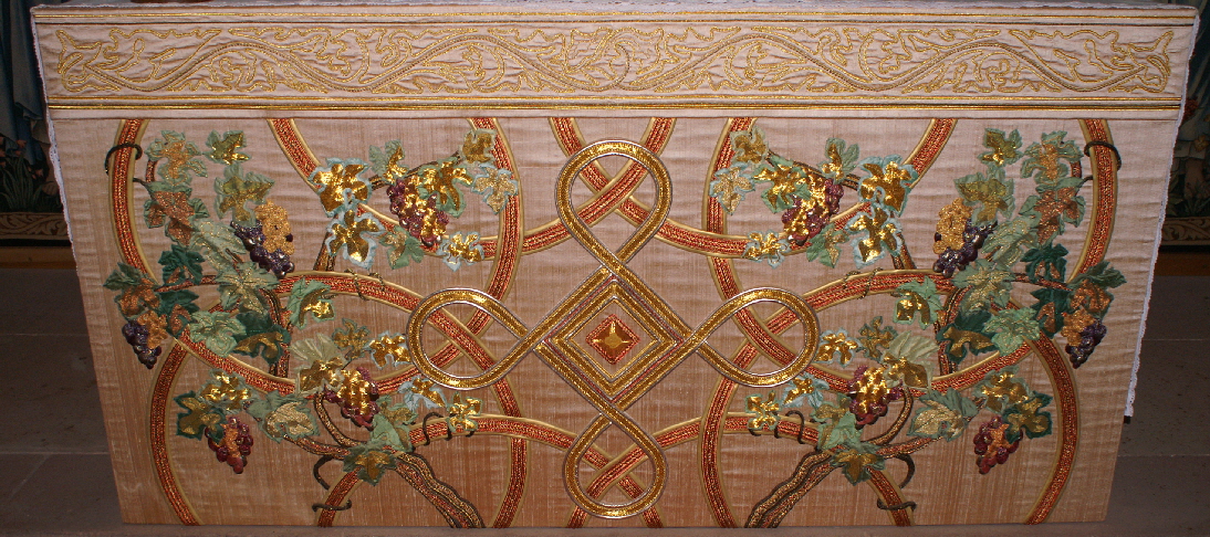
Left: The nave again from the south east. Notice that the four arches at the crossing are identical in size and profile, maintaining the pleasing symmetry of the whole structure. It means, though, that there is not an extravagant (and richly decorated) chancel arch such as you would expect to see in mediaeval architecture. Right: The chancel. The tapestries and altar cloth are by Burne-Jones. |
||||||||||||||||||||||||||||
 |
 |
 |
||||||||||||||||||||||||||
|
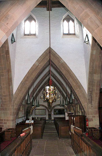
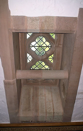
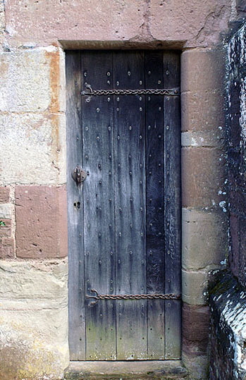
Left: This view to the west through the chancel arch shows the proportions of the tower. Why did Lethaby not put the bells in the towe rhere? My suspicion is that he always intended the chandelier to be perfectly positioned and proportioned for maximum visual effect. If he had added a bell chamber to the tower not only would it have spoiled the proportions of the tower itself but the through view from east to west would have been marred by ugly hanging bell ropes. Note the wall lights either side of the tower which match the pendant lights. Centre: One of Whall’s single light nave windows (most are double). It has a double quatrefoil rather like a figure eight. The recess is deeply splayed. The round-profile transom bar on the inside of the recess is one of the few things in this church which to me makes no practical or aesthetic sense to me. “Neither use nor ornamant” my late Mother-in-Law might have said (possibly about myself!). But then I am not an artist! Right: In another nod towards Norman design, the chancel has a north priest’s door. Like its older counterparts it has no obvious use today and I am sure it is equally redundant. In fact, when I think about it which I hadn’t before, I don’t think I have ever come across an unlocked priest’s door in all my travels! Lethaby has adorned it with distinctly Viking-looking iron hinges. |
||||||||||||||||||||||||||||
 |
||||||||||||||||||||||||||||
 |
||||||||||||||||||||||||||||
|
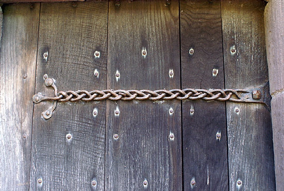
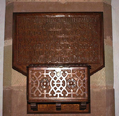
Left: The north door hinge. The door is perhaps o of the only self-consciously “rusticated” features of the church. No Viking smith would have plaited an iron hinge so unevenly if he had the technology to make it perfect. Similarly, the door nails are not only deliberately unevenly spaced but probably also superfluous. Right: The lovely alms box is later than the rest of the church. The inscription explains that it was funded from money found on Cedric Foster of the Grenadier Guards who was mortally wounded at Neuve-Chapelle in 1915. |
||||||||||||||||||||||||||||
 |
||||||||||||||||||||||||||||
|
Burne-Jones’s glorious embroidered altar cloth. The vine is a very early Christian symbol so, again we see the Arts & Crafts movement’s love of the traditional. |
||||||||||||||||||||||||||||
 |
||||||||||||||||||||||||||||
|
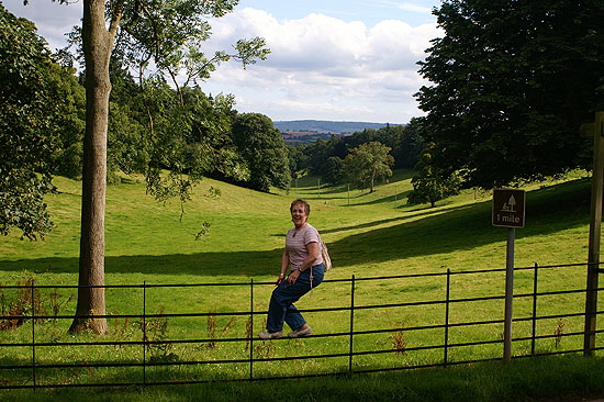
Church crawling is fun - honest! Diana sees the funny side of life astride a fence directly opposite Brockhampton Church. |
||||||||||||||||||||||||||||
|
|
||||||||||||||||||||||||||||
